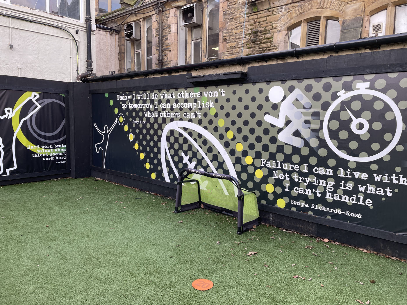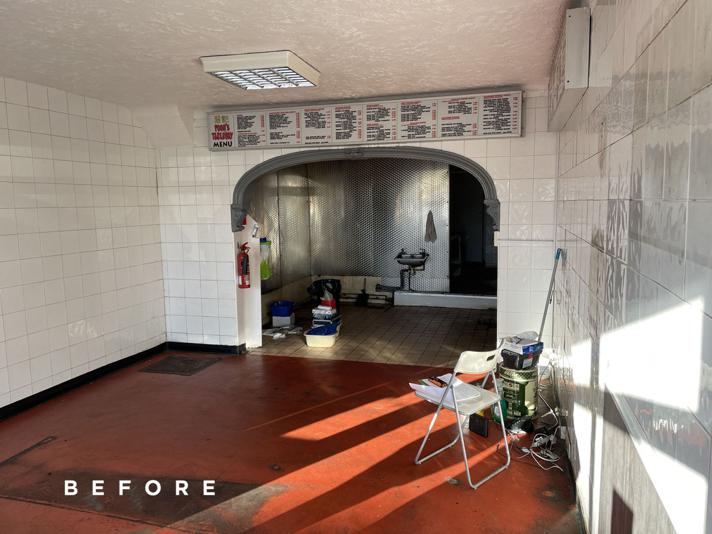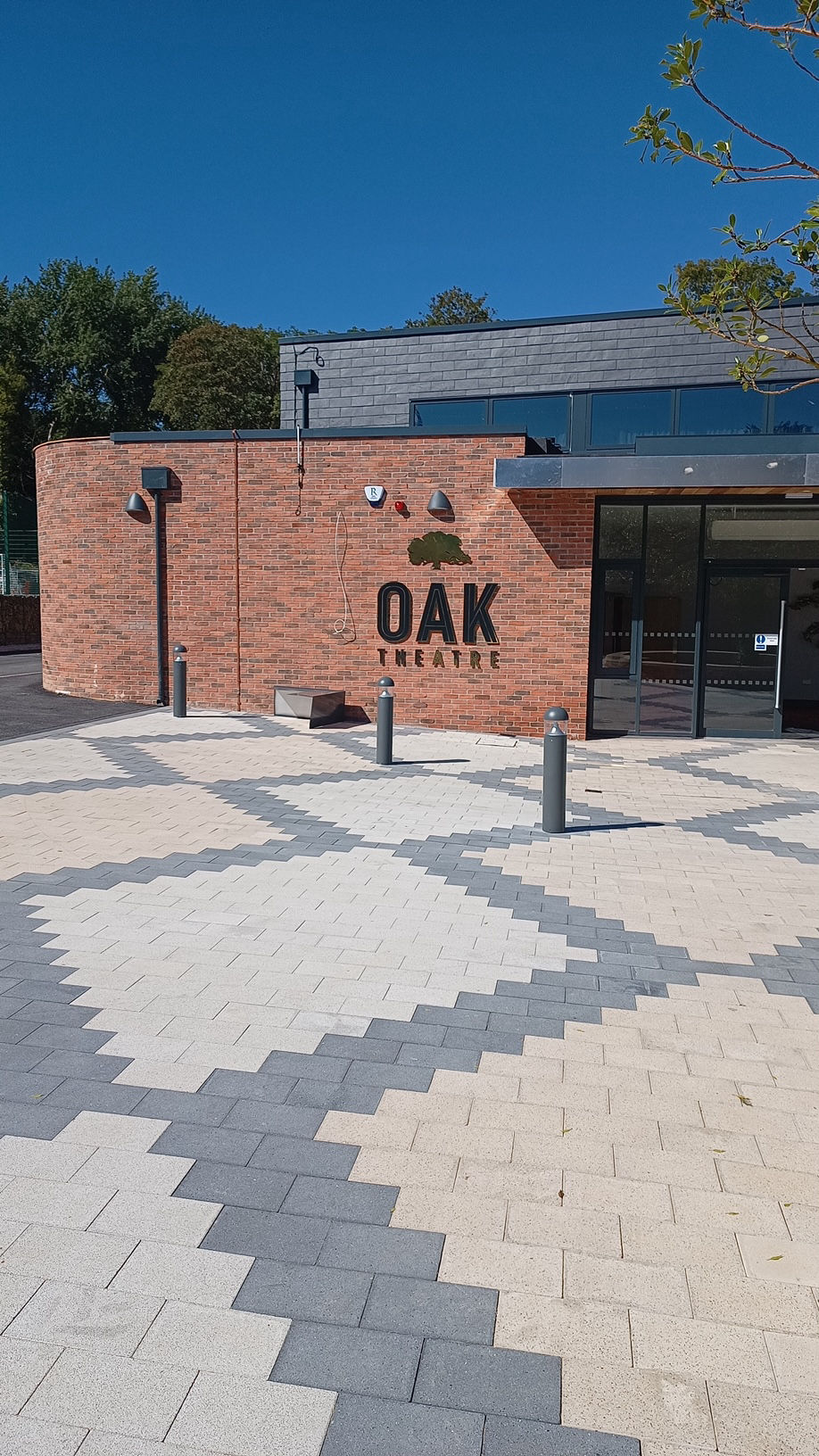
We have recently been asked to design the branding, signage and wall graphics for The Oak Theatre and Studios in West Lancashire.
This is an exciting and inspiring new build facility that has been created to give not only the local school a superb nationally important arts theatre and studio rooms but it will be used for corporate meetings, as well as a space that can be used to host community needs as well as regional and national events.
The brief had to also be a tribute to the personal involvement of one of the team's inspirational leaders and a driving force behind this surprising project, which includes one of the area's largest and most modern theatre and performance spaces, as well as soundproofed practice studios for music, dance and drama.
• Branding • Exterior Sign Design & Installation • Interior Wayfinding Signage • Interior Wall Graphics • Printed support material
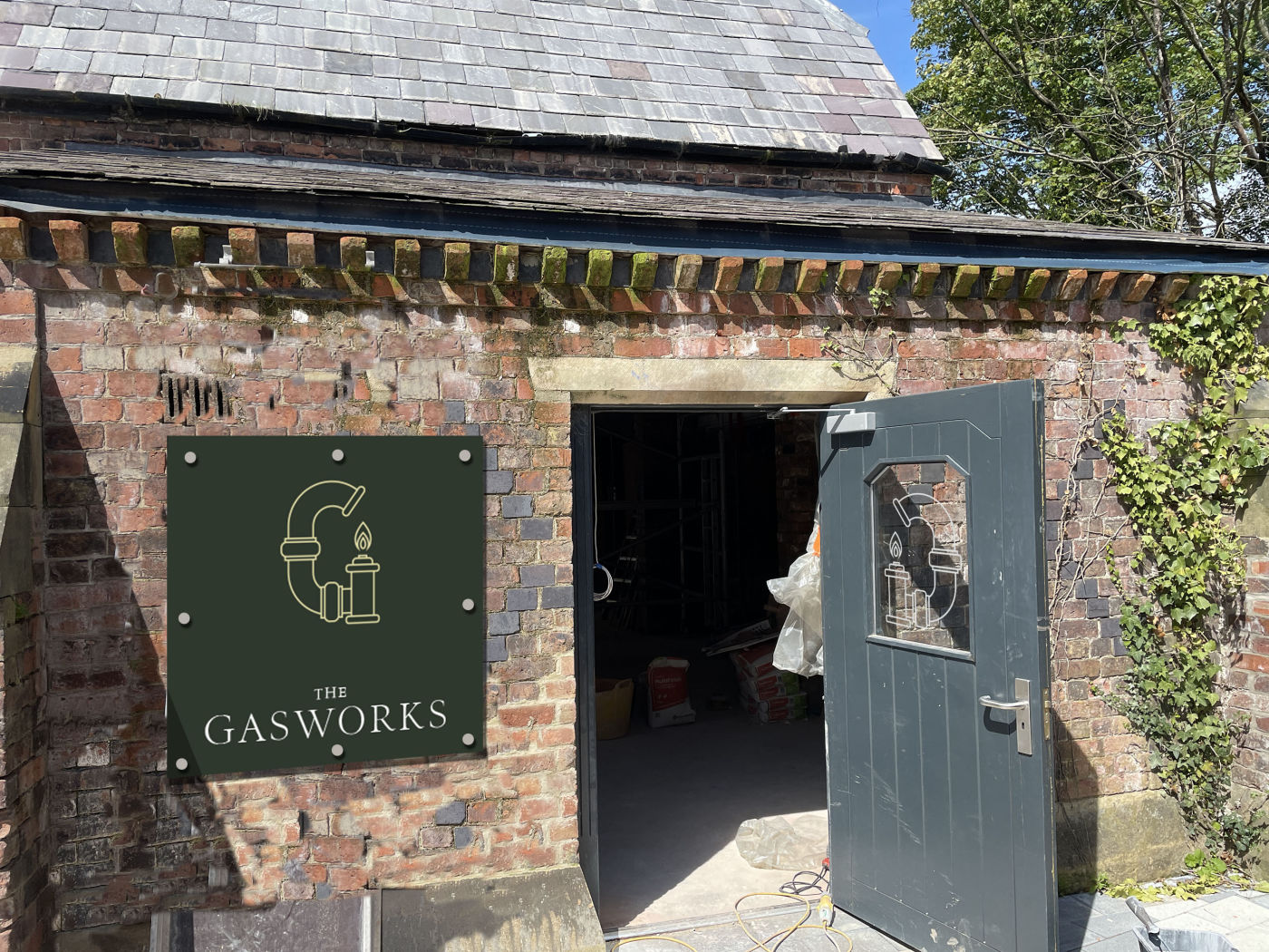
As part of the Oak Studios Performing Arts Centre, within the site there was also a Grade II listed country house gas works that we've also rebranded as an artisan cafe for pupils and visitors alike.
• Branding • Exterior Sign Design & Installation • Interior infographics • Interior Wall Graphics • Printed Graphics
Following the interior and exterior design of their successful restaurant in Southport, the restaurant owners wanted more of the same in their venue in Liverpool city centre!
Images of daily life in Italy, printed on large panels were the perfect - and relatively inexpensive - way to make a large elegant room more fun. Italian street scenes using a mix of photographs of our own and the owner's really personalised the restaurant space.
We designed the branding, exterior and interior signage, menus and collateral marketing material, as well as the interior graphics, colour scheme and more. Our expertise even extends to the website and online marketing - the full design and marketing package…
After a period in the educational doldrums, the new dynamic team taking over the site a few years ago asked us to rebrand the School to reflect their new ambitions. Since then, Scarisbrick Hall School has become one of the north's leading private educational establishments, with a more than 500% increase in pupils over the last decade. We have been an integral part of that success, creating branding, design, marketing and communication material for the Director team.
Short term, wall graphics have been a successful and cost effective solution for large transit areas in school. These are especially cost effective in some of the older areas of this renowned Victorian institute, as it transitions to a much more modern educational pioneer.
Using wallpapers and graphics with custom designs - mostly with an educational slant - has been the perfect way to brighten up many walls within a historic building, whilst providing information and inspiration to the ever growing pupil population.
We have also been called on to create both permanent and temporary graphics, as well as more permanent information and promotional signage throughout the 50 acre site. With new exciting buildings complementing high quality restoration of this world-renowned hall, we offer a design service that bridges old and new, educational and exciting.
• Branding and Design Guides • Exterior and Interior Signage • Interior Design for New Build • Wall Graphics • Exterior Graphics • Marketing and Collateral Design for Print and Online
Following the interior and exterior design of their successful restaurant in Southport, the restaurant owners wanted more of the same in their venue in Liverpool city centre!
Images of daily life in Italy, printed on large panels were the perfect - and relatively inexpensive - way to make a large elegant room more fun. Italian street scenes using a mix of photographs of our own and the owner's really personalised the restaurant space.
Interior Design • Exterior design and decor including signage, canopy graphics, menu holders and window promotional graphics • Branding • Design and Print of Menus and collateral marketing material • Interior Wall graphics • Colour scheme • Online marketing - website and email marketing
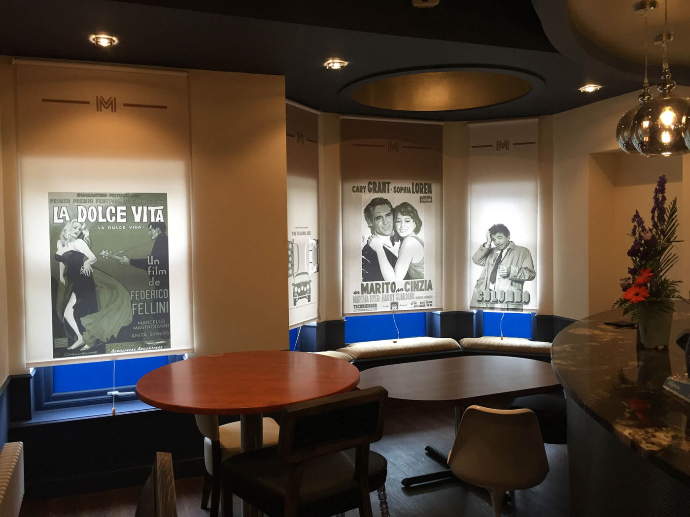
Dolce Vita is a well established family run Italian restaurant. In spite of being one of Ainsdale's traditional "go to" eateries, incoming competition from other restaurants meant it was in need of a major update. After a long consultation, we helped the owners bring the place back to life and reflect their strong Italian heritage.
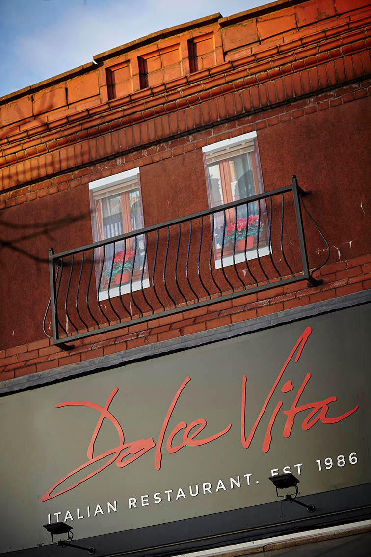
Our theme was a Roman street scene, even adding a false balcony window on the front facade. Wall graphics were used extensively, matched to a cobblestone effect floor and much more to give a real feel of the "dolce vita" - and a complete design refresh kept existing customers happy whilst attracting a whole new audience who appreciated the fun element of "Roman" street food.
• Logo and branding • Interior Design Scheme • Interior and Exterior Signage • Wall and Ceiling Graphics • Door & Window Graphics • Exterior Theming
Following the successful redesign of their function room above, we were tasked with a redesign of a very popular busy village centre cafe. The refurbishment work was undertaken within just a few days, thanks to careful planning and liaison.
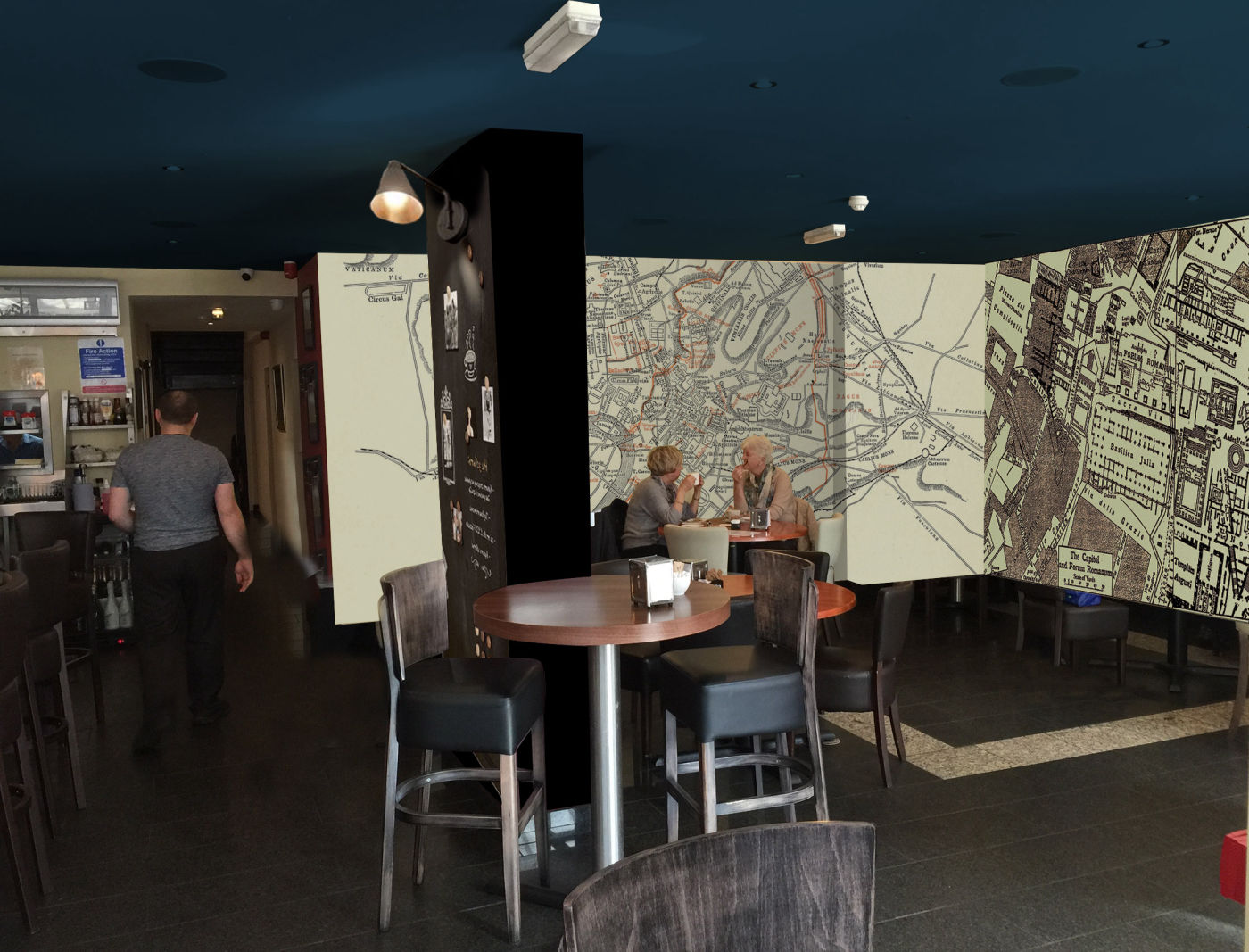
As the owners are of Roman descent, we decided to base the theme on antique Roman maps and the use of large format wall graphics lent itself to the project's scale and speed. A one-off chalkboard column allows for daily specials to be posted in a unique way. Outside, we brought the pavement seating to life with new ideas and new graphics, reflecting the food and drink on offer.
• External Seating Area Graphics • Exterior Signage • Window Graphics • Interior Wall Designs • Print Design • Branding
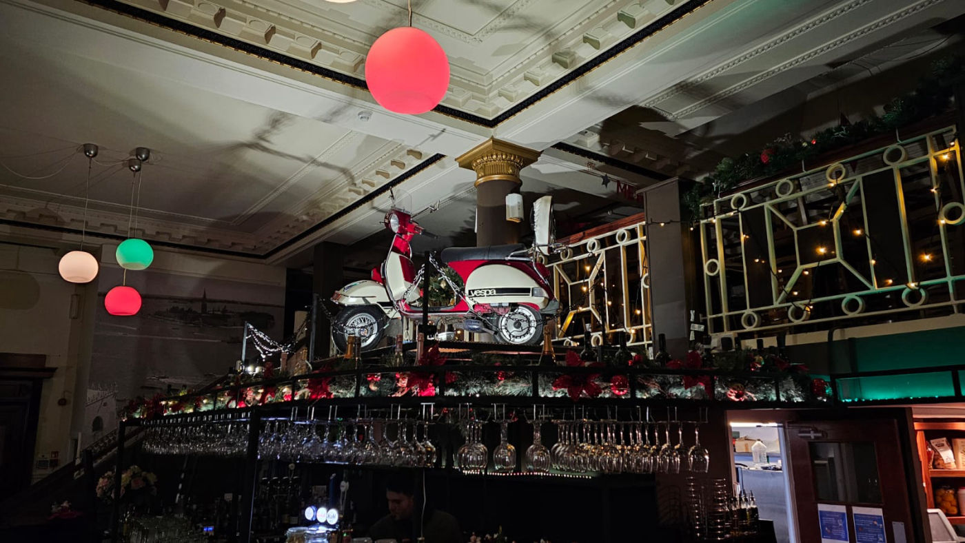
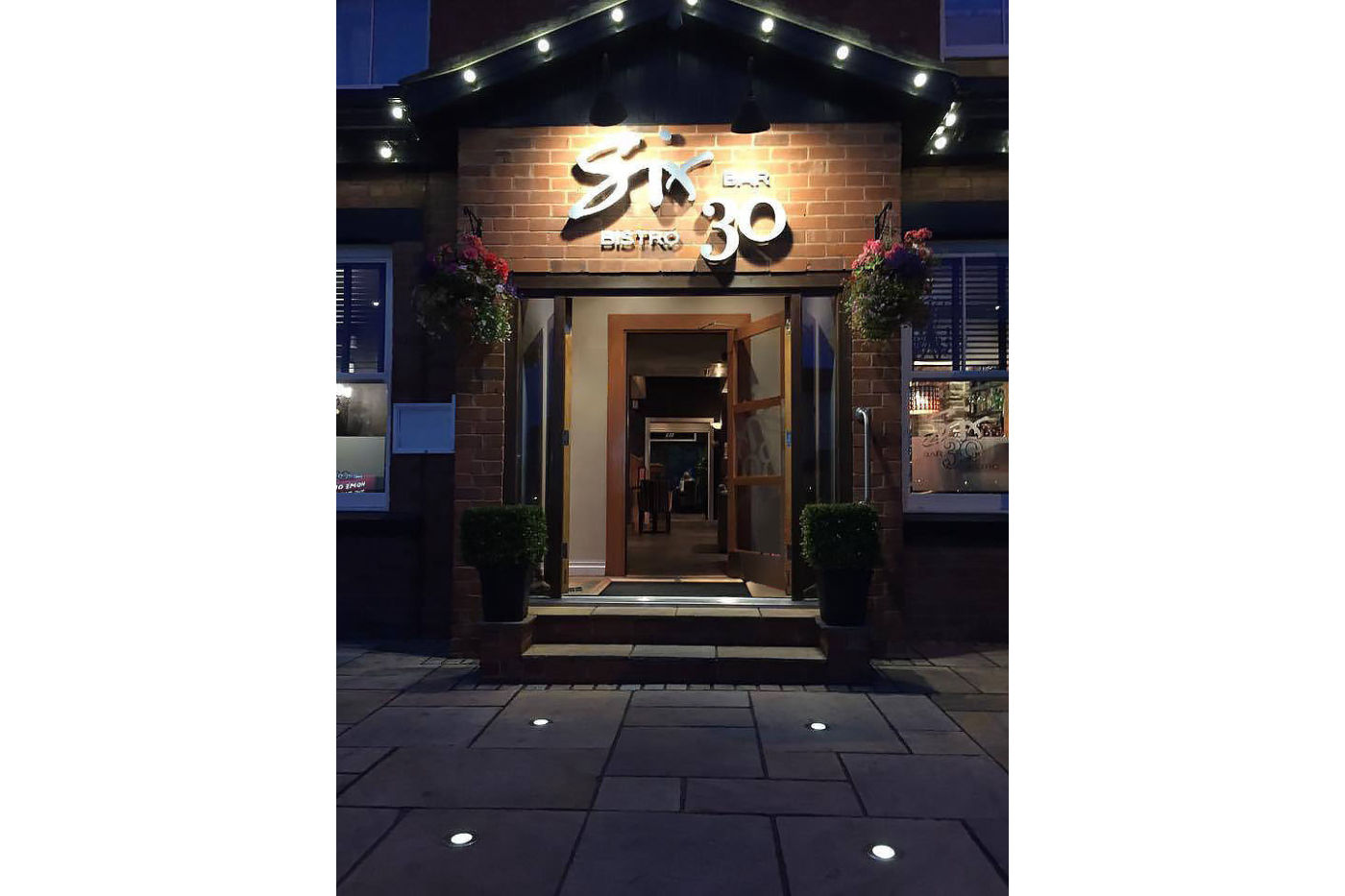
A simple and swift refresh was called for to make the family bar and bistro more elegant.
With a bolder approach to colour, the atmosphere became more intimate and warm. By clever application of inexpensive accessories, this popular bistro took on a friendlier yet more contemporary feel.
• Branding • Exterior Sign Design & Installation • Interior Design • Interior Wall Graphics • Printed support material • Sourcing
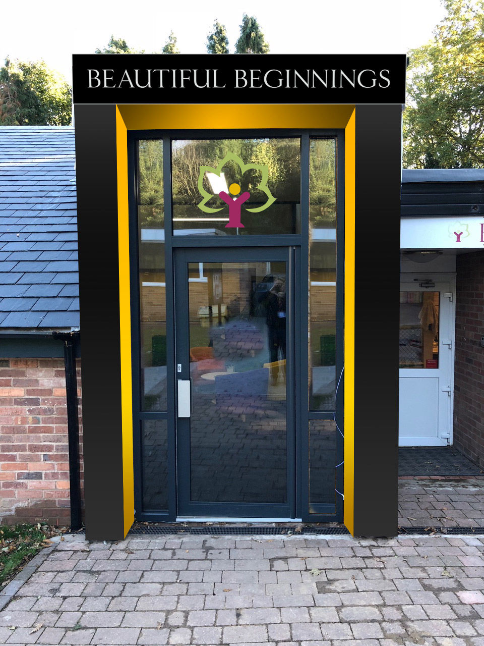
A new build extension on an existing (old) nursery building needed additional input to really maximise the building's potential. We designed the exterior graphic and signage as well as the large and impressive entrance space. Combining wall graphics, colour scheme, furnishings and signage to make for a bright and welcoming entry.
• Interior Design • Wall Graphics • Paint schematic • Furnishing • Exterior SIgnage
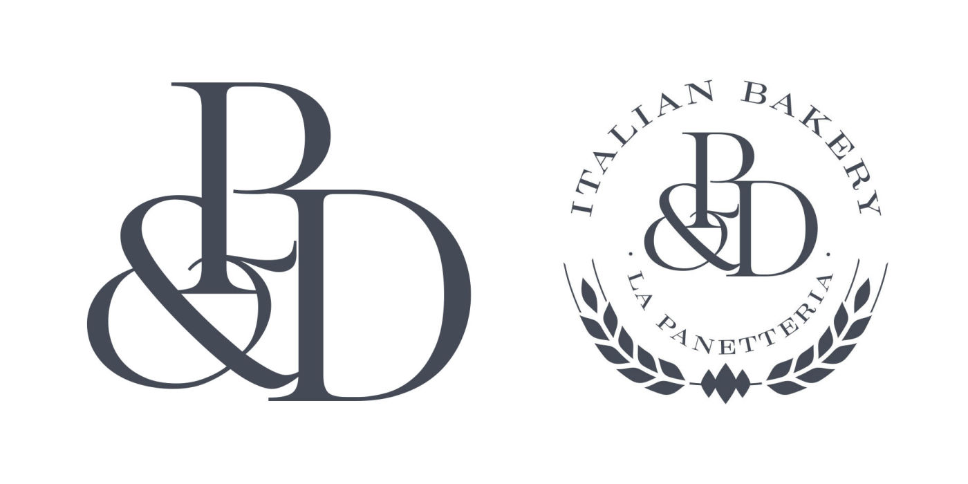
Paulo & Donato is a very successful pasticceria in Liverpool City Centre. We were asked to add a separate new business on the same premises. We created a new logo and brand for P&D, then an identity for La Panetteria, the Italian Bakery - a separate part of the same company. The division has been created successfully using strong colours and graphic panels.
• Logo • Branding • Wall Graphics • Menus • Paint schematic • Printed Collateral Material
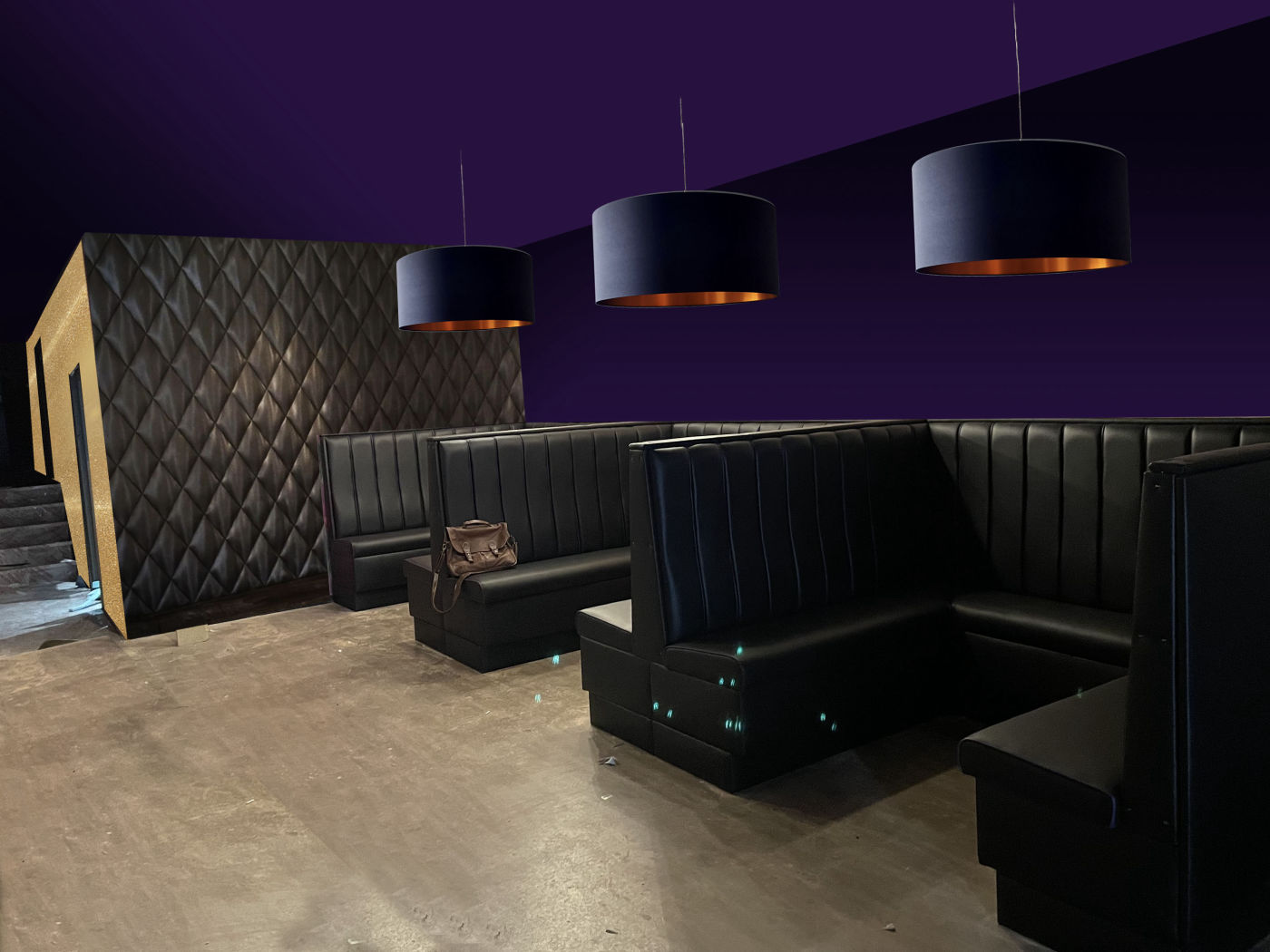
Bar Twelve is a complete refurbishment of a space that has become one of this University town's most popular evening spots - a bar with dance space attached. It had to appeal to a local and student audience, so we introduced some fun with a strong brand logo, window treatment around the entrance sign and a signature bar with backlit stone.
• Interior design • Exterior Signage and Branding • Wall Graphics • Fixtures Sourcing
Yet another design project in this up and coming village where street cafés, bars and restaurants are becoming more and more a part of the high street scene.
A new venture and a challenging space to design - turning a former Chinese takeaway into an elegant contemporary bar and dining space isn't the most obvious choice, yet by being creative with the space, opening up the front entirely and building in seating, we created a warm yet surprisingly spacious gathering space.
As well as designing the logo and brand, we designed a functional layout to maximise the small area - opening up the front on sunny days means there is a much more open feel, with the option of pavement café seating, with modern colour choices and finishes to match.
• Interior design • Exterior Signage and Branding • Furniture Design and Sourcing • Lighting • Logo design
A new venture for one of our successful restaurateur clients - taking on an old launderette and turning it into an artisan deli meant for a bit of creative design thinking…
We designed a stylish logo to reflect high end ambitions, with a reference to Italy and olive oil, which is one of their specialist grocery items. The interior design included taking the walls back to brick (sealed) for an authentic feel, with a feature wall panel at the rear of the shop, where the more specialist items and wines are stored.
Using smart finishes on the signage and a strong graphic window element is a design statement that shows passers-by the quality they can expect inside.
• Logo design • Exterior Signage and Branding • Wall Graphics • Interior Design and Finishes
As a subsidiary of Prescott & Co, an experienced graphic and web design agency based in Southport Lancashire, we're used to designing in and around the north west, particularly for clients in Cheshire and Merseyside but we are happy to work anywhere!
Our background in graphic design gives us an edge when it comes to branding, advertising and even web design for your business - we consider ourselves a one-stop-shop when it comes to a design project, big or small. And naturally almost all our projects have involved designing artwork and logos as well as the restaurant design or wall graphics.
Even if all you need is a new logo and colour scheme, we're able to handle it. From menu design to websites, signage to lighting, we think we can help.
Get in touch with David to discover more…
Based near Southport on the border of Lancashire & Merseyside, we create great designs for the north west and beyond…